Hello and welcome! In today’s lesson, we’re going to take a look at how to switch up our analysis and look at the values a different way.
Last time, we ended up with a pivot table that looked something like this:
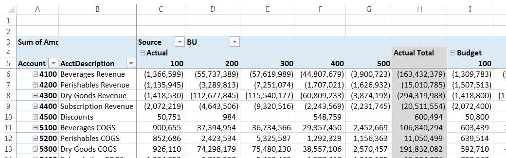
As you can see, the different Account categories are down the side and our Actuals and Budgets are across the top. However, let's say we've had a request to summarize the Actual and Budgeted Revenues to date by BU.
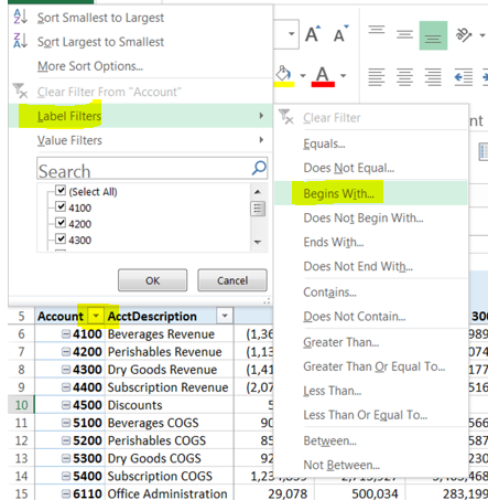
First, we hide the accounts we don't need by using the filter drop-down in the Account header in the pivot table (* Note: we're not deleting the other accounts, just hiding them. That way, the data will be available later if we want to look at it a different way!)
All of our revenue accounts start with a 4, so we'll use Label > Begins with… and then type a 4 in the box, as follows:
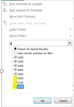
Or, we could just type a 4 in the Search box. We would need to be careful to un-select any other accounts that were listed because they contained a 4, though:
Once we just have the Revenue accounts listed for Budget and Actual, it makes for a very wide and short report, which is not so great for review or printing by others, even though it does have the totals we're looking for:
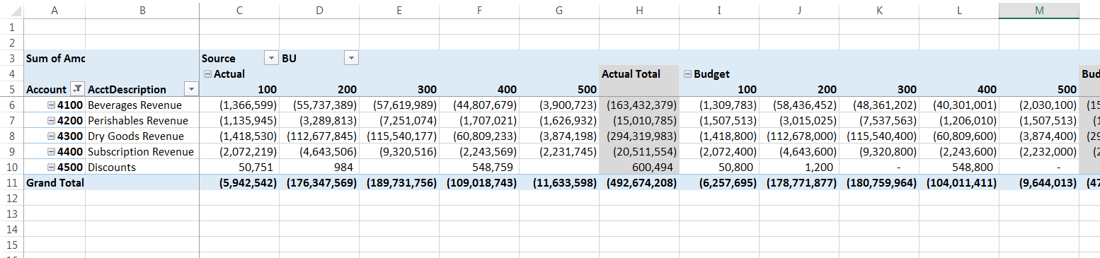
To keep it concise and easier to read, it would make more sense to put the revenue accounts across the top, since there are only 5 of those and there are way more BUs and Actual/Budget columns. Click anywhere on the Pivot Table and the Pivot Table Field List appears on the right side of the screen. If it doesn't, we simply Right-Click on the Pivot Table and select Show Field List (or select Analyze > Show > Field List on the Ribbon).
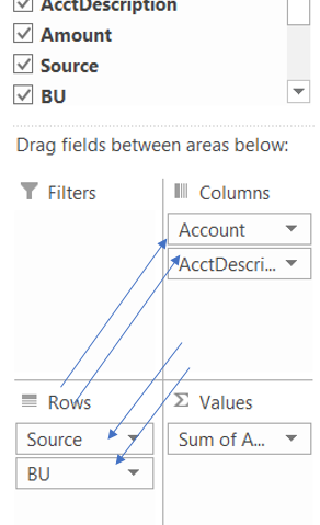
In the Field List boxes, we drag the Account and AcctDescription fields to the Columns box and drag the Source and BU fields to the Rows box (it doesn't matter what order we drag them in.)
That's all we have to do - that's it! Instantly, all of our totals have shifted around to make for a much more concise, readable report - wouldn't you agree?
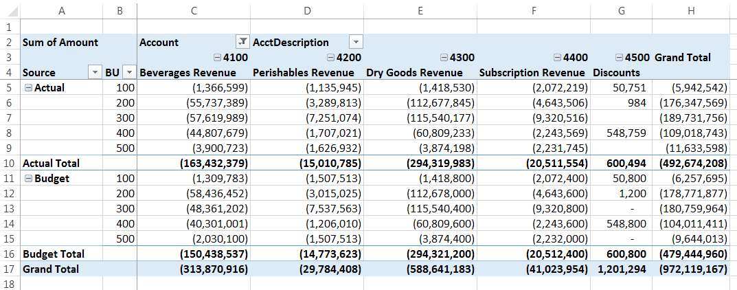
I especially like it because it is much easier to compare Actuals to Budgets for each of the BUs and each of the Revenue Types this way as well.
Have you been playing with your own data in pivot tables yet? How's it going? Any questions? I'd love to hear from you! Please leave a comment below or send me an email at mariana@xcellerations.com! 🙂
Thanks for stopping by!
p.s. You can check out other posts on the Blog feed and/or Sign up to be notified when the next post is available.
2 Comments
gold
May 5, 2017whoah this blog is wonderful i really like reading your posts. Stay up the great work! You already know, lots of persons are looking around for this info, you can help them greatly.
online learning
April 30, 2017These are really enormous ideas in concerning blogging. You have touched some pleasant things here. Any way keep up wrinting.
http://eduhints.eu
Leave A Response
You must be logged in to post a comment.